Project Overview
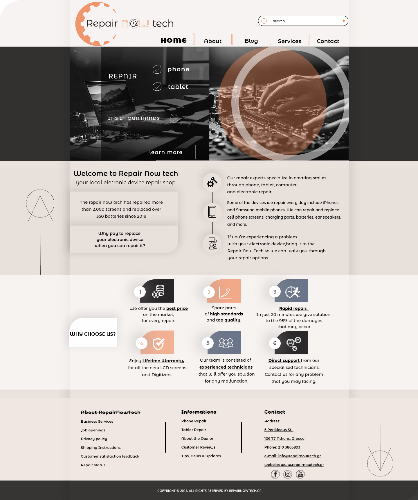
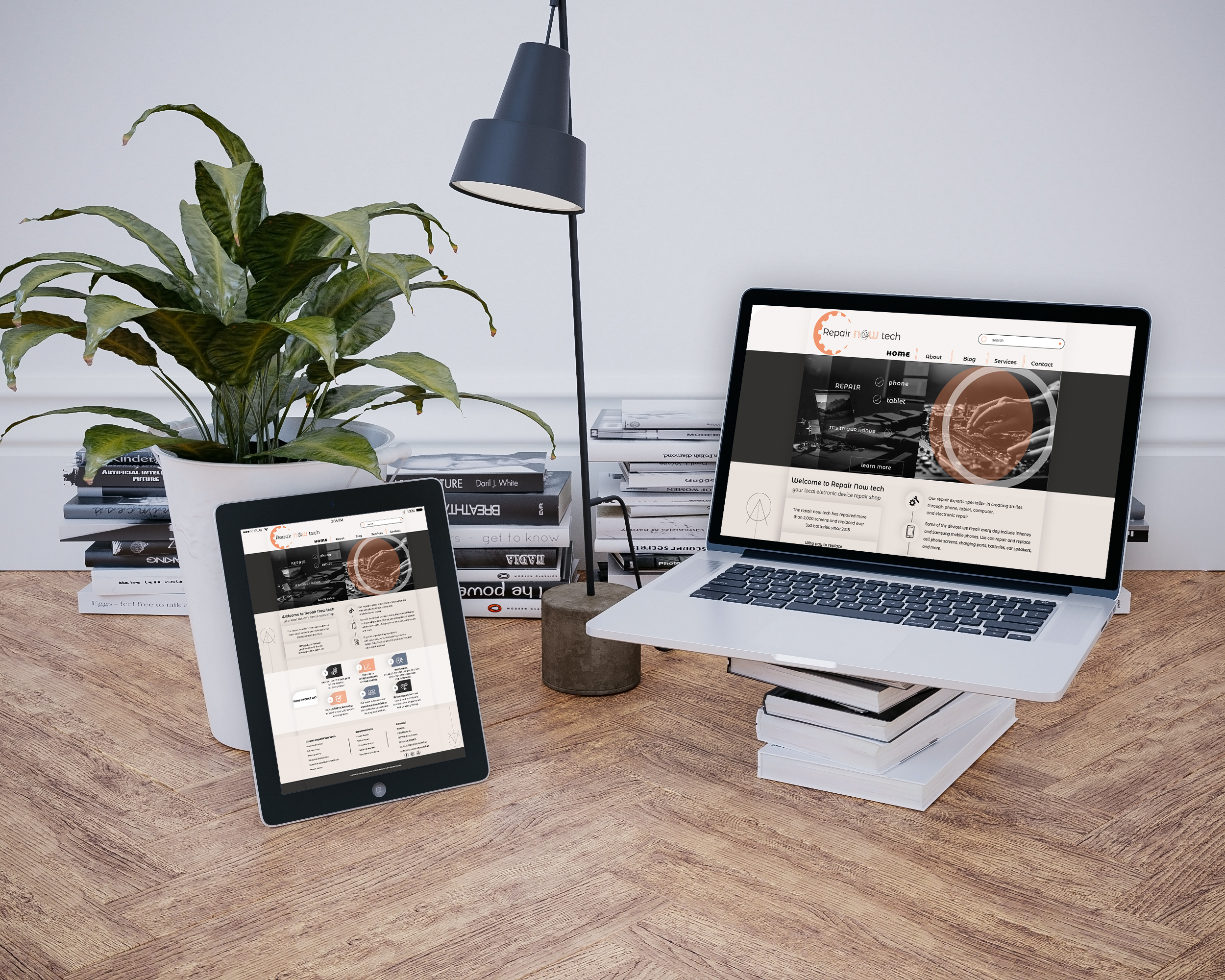
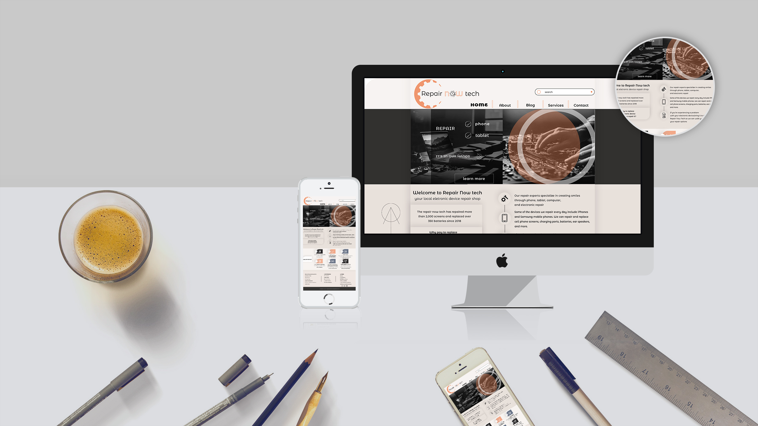
For Repair Now Tech, I wanted to build a brand that looks as professional as the tools they use. I started with the logo, combining a gear with a clock to show both "repair" and "speed." Then, I designed the home page and marketing banners, keeping a consistent look with earthy tones and technical details. Finally, I used mockups to see how the site feels in a real environment, like on a desk next to tech books and gear.
The Challenge
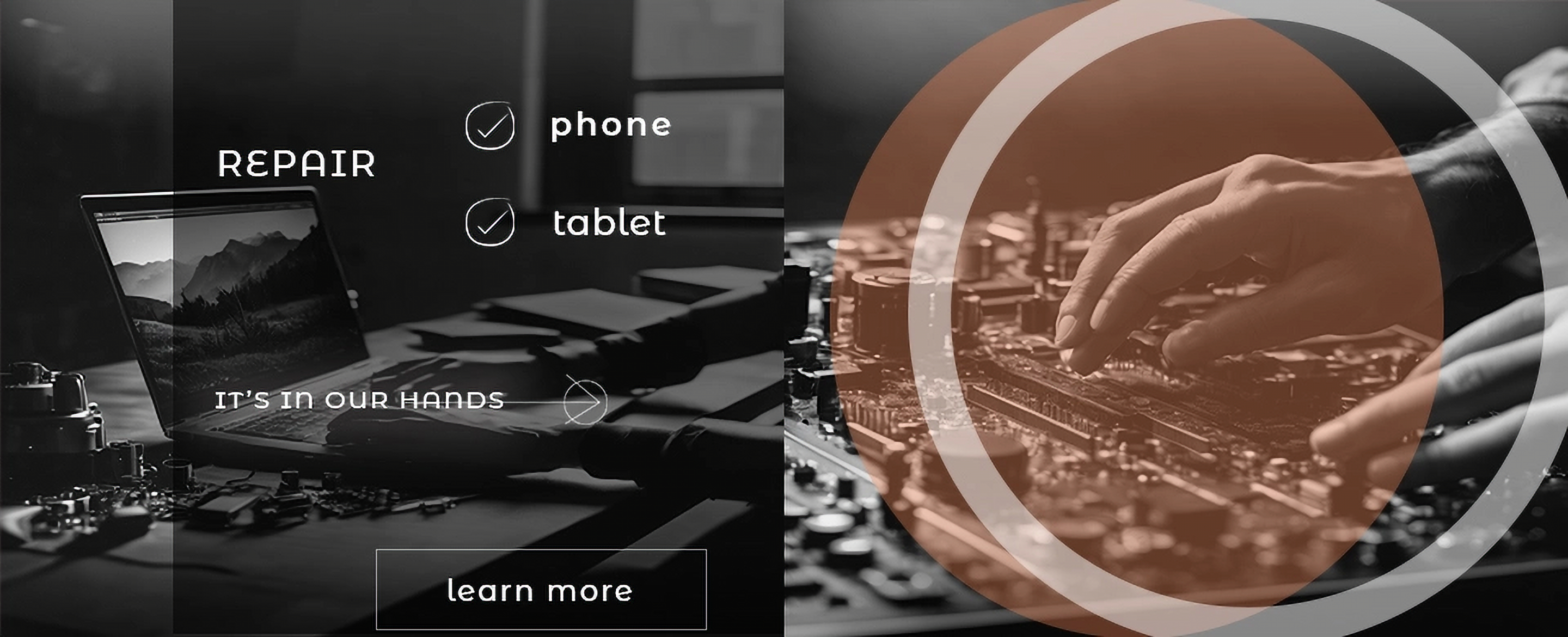
The main challenge was to show that this is a serious tech lab. I had to fit a lot of specific info on the home page—like the repair statistics and the "Why choose us" section—without making it look cluttered. I also had to make sure the banners, featuring technical close-ups and motherboard details, had the same industrial vibe as the website.
The Solution
I used a palette of warm greys, sand, and muted orange to make the brand stand out from typical blue-toned tech sites.
- The Interface: I used custom icons for the service blocks and kept the typography clean so users can find the "Repair Status" or contact info instantly.
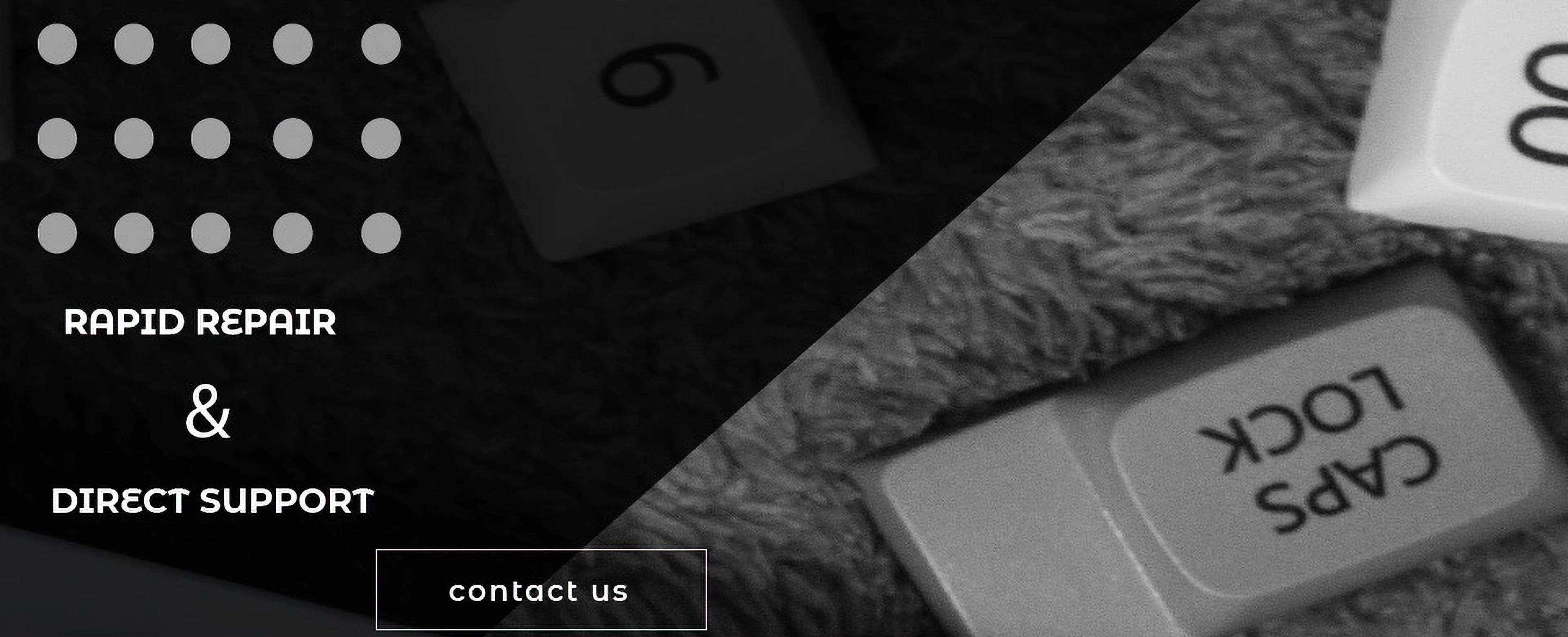
- Graphic Elements: On the banners, I used semi-transparent circles to emphasize the technical nature of the work.
- Visual Consistency: Every element, from the hero banner to the footer, follows a strict grid that communicates precision.
Final Template Design